Data visualization với ggplot2. Chuyển đổi từ ggplot2 objects sang biểu đồ tương tác plotly
Nạp các thư viện cần thiết vào phiên làm việc của R
library(rvest)
library(ggplot2)
library(plotly)
library(dygraphs)
library(tidyverse)
Get dữ liệu bitcoin từ trang CoinMarketcap để thực hiện data visualization:
# Get history data of bitcoin 28/04/2013 - 23/08/2020
url <-read_html("https://coinmarketcap.com/currencies/bitcoin/historical-data/?start=20130428&end=20200823")
data <- url %>% html_table()
df <- data[[3]]
df <- as_tibble(df)
colnames(df) <- c("date", "open", "high", "low", "close", "volume", "market_cap")

# Chuyển cột date từ dạng strings về 'date'
df$date <- lubridate::mdy(df$date)

# bỏ dấu ',' trong các giá trị của dữ liệu
df$close <-  gsub(",", "", df$close)

# Chuyển dữ liệu cột close về dạng numeric
df$close <- as.numeric(df$close)
Kiểm tra bảng dữ liệu thu được:
df## # A tibble: 2,676 x 7
## date open high low close volume market_cap
## <date> <chr> <chr> <chr> <dbl> <chr> <chr>
## 1 2020-08-24 11,663.69 11,807.63 11,623.25 11775. 20,681,511,755 217,477,962,6~
## 2 2020-08-23 11,679.70 11,713.43 11,559.92 11665. 18,482,062,658 215,439,967,3~
## 3 2020-08-22 11,585.48 11,689.41 11,448.81 11682. 20,224,191,306 215,742,068,8~
## 4 2020-08-21 11,878.03 11,899.26 11,564.98 11592. 23,762,425,999 214,082,401,8~
## 5 2020-08-20 11,761.50 11,900.41 11,710.06 11878. 20,175,242,945 219,350,310,3~
## 6 2020-08-19 11,990.88 12,028.92 11,687.33 11758. 24,502,851,117 217,122,068,3~
## 7 2020-08-18 12,251.90 12,335.71 11,954.53 11991. 26,043,227,672 221,413,097,5~
## 8 2020-08-17 11,895.66 12,359.06 11,806.70 12254. 28,227,687,027 226,261,747,5~
## 9 2020-08-16 11,866.69 11,934.90 11,737.19 11893. 20,583,375,490 219,576,092,1~
## 10 2020-08-15 11,768.70 11,963.20 11,768.70 11866. 23,354,924,400 219,064,372,7~
## # ... with 2,666 more rowsCách scrape một trang web bằng R và get dữ liệu lịch sử thị trường tiền điện tử các bạn có thể đọc ở bài trước của tôi tại đây.
Data visualization với ggplot2:
# Plot using ggplot2
pp <- ggplot(data = df, aes(x = date, y = close))
pp <- pp + geom_line(colour = "blue")
pp <- pp + labs(title = "Historical data for Bitcoin",
     subtitle = "Accessing Bitcoin Data",
     caption = "sources: Bitcoin (BTC); https://coinmarketcap.com",
     x = "Date",
     y = "Close")
pp <- pp + theme_bw()
pp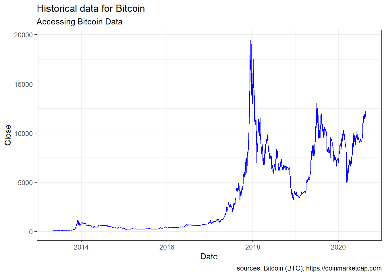
Để chuyển ggplot2 object về dạng biểu đồ tương tác plotly ta dùng hàm ggplotly() trong thư viện plotly:
ggplotly(pp)Cuong Sai
PhD student
My research interests include Industrial AI (Intelligent predictive maintenance), Machine and Deep learning, Time series forecasting, Intelligent machinery fault diagnosis, Prognostics and health management, Error metrics / forecast evaluation.