Biến đổi và trực quan hóa dữ liệu Covid-19 từ John Hopkins database với R
Covid-19 là một đại dịch bệnh truyền nhiễm với tác nhân là virus SARS-CoV-2, hiện đang ảnh hưởng và gây thiệt hại nặng nề trên phạm vi toàn cầu. Kể từ khi đại dịch Covid-19 bắt đầu xuất hiện ở Vũ Hán - Trung Quốc đến nay, cái tên trường Đại học Jonhs Hopkins (Mỹ) được nhắc đi nhắc lại hằng ngày trên các phương tiện truyền thông và là một trong những cụm từ được trích dẫn nhiều nhất. Lý do đó là Đại học Johns Hopkins đã phát triển một trong những hệ thống theo dõi dữ liệu COVID-19 bền bỉ và đáng tin cậy nhất trên thế giới cho đến nay.
Ở bài trước tôi đã giới thiệu cách download và trực quan hóa dữ liệu Covid-19 từ John Hopkins database sử dụng ngôn ngữ Python, cụ thể là sử dụng thư viện pandas để làm sạch và biến đổi dữ liệu và maplotlib để trực quan hóa dữ liệu. Ở bài này để chứng minh R là ngôn ngữ nổi trội trong biến đổi và trực quan hóa dữ liệu, tôi cũng thực hiện công việc tương tự như với Python. Cụ thể là sử dụng thư viện dplyr và ggplot2 trong hệ sinh thái tidyverse kết hợp với toán tử pipes khiến cho việc làm sạch, biến đổi và trực quan hóa dữ liệu trở nên vô cùng đơn giản - chỉ bằng vài dòng code. Để so sánh sự khác biệt các bạn có thể đọc lại bài trước về Python tại đây. Để biết thêm về toán tử pipe %>% cũng như cách dùng các pipes khác trong R các bạn có thể đọc tại đây.
Nội dung chính của bài bao gồm:
1. Download & chuẩn bị dữ liệu Covid-19 sử dụng thư viện dplyr
2. Trực quan hóa dữ liệu Covid-19 sử dụng thư viện ggplot2
1. Download và chuẩn bị dữ liệu
Nạp gói tidyverse vào phiên làm việc của R để thực hành:
library(tidyverse)Download 3 tập dữ liệu từ John Hopkins database:
Confirmed:(Số trường hợp mới phát hiện)Deaths:(Số trường hợp tử vong)Recovered:(Số trường hợp hồi phục)
url_confd = 'https://raw.githubusercontent.com/CSSEGISandData/COVID-19/master/csse_covid_19_data/csse_covid_19_time_series/time_series_covid19_confirmed_global.csv'
url_death = 'https://raw.githubusercontent.com/CSSEGISandData/COVID-19/master/csse_covid_19_data/csse_covid_19_time_series/time_series_covid19_deaths_global.csv'
url_recvd = 'https://raw.githubusercontent.com/CSSEGISandData/COVID-19/master/csse_covid_19_data/csse_covid_19_time_series/time_series_covid19_recovered_global.csv'

df_confd_raw = read.csv(url_confd)
df_death_raw = read.csv(url_death)
df_recvd_raw = read.csv(url_recvd)
Các tập dữ liệu này được lưu ở dạng wide format do đó chúng ta cần chuyển chúng dạng long fromat:
# Chuyển tập dữ liệu df_confd từ wide format sang long fromat
df_confd <- df_confd_raw %>% gather(key="Date", value="Confirmed", -c(Country.Region, Province.State, Lat, Long)) %>% group_by(Country.Region, Date) %>% summarize(Confirmed=sum(Confirmed))

# Chuyển tập dữ liệu df_death từ wide format sang long fromat
df_death <- df_death_raw %>% gather(key="Date", value="Deaths", -c(Country.Region, Province.State, Lat, Long)) %>% group_by(Country.Region, Date) %>% summarize(Deaths=sum(Deaths))


# Chuyển tập dữ liệu df_recvd từ wide format sang long fromat
df_recvd <- df_recvd_raw %>% gather(key="Date", value="Recovered", -c(Country.Region, Province.State, Lat, Long)) %>% group_by(Country.Region, Date) %>% summarize(Recovered=sum(Recovered))
Kiểm tra dữ liệu sau khi đã chuyển:
head(df_confd)## # A tibble: 6 x 3
## # Groups: Country.Region [1]
## Country.Region Date Confirmed
## <chr> <chr> <int>
## 1 Afghanistan X1.22.20 0
## 2 Afghanistan X1.23.20 0
## 3 Afghanistan X1.24.20 0
## 4 Afghanistan X1.25.20 0
## 5 Afghanistan X1.26.20 0
## 6 Afghanistan X1.27.20 0head(df_death)## # A tibble: 6 x 3
## # Groups: Country.Region [1]
## Country.Region Date Deaths
## <chr> <chr> <int>
## 1 Afghanistan X1.22.20 0
## 2 Afghanistan X1.23.20 0
## 3 Afghanistan X1.24.20 0
## 4 Afghanistan X1.25.20 0
## 5 Afghanistan X1.26.20 0
## 6 Afghanistan X1.27.20 0head(df_recvd)## # A tibble: 6 x 3
## # Groups: Country.Region [1]
## Country.Region Date Recovered
## <chr> <chr> <int>
## 1 Afghanistan X1.22.20 0
## 2 Afghanistan X1.23.20 0
## 3 Afghanistan X1.24.20 0
## 4 Afghanistan X1.25.20 0
## 5 Afghanistan X1.26.20 0
## 6 Afghanistan X1.27.20 0Gộp 3 tập dữ liệu này thành 1 dataframe:
final_df <- full_join(df_confd, df_death) %>% full_join(df_recvd)
head(final_df)
## # A tibble: 6 x 5
## # Groups: Country.Region [1]
## Country.Region Date Confirmed Deaths Recovered
## <chr> <chr> <int> <int> <int>
## 1 Afghanistan X1.22.20 0 0 0
## 2 Afghanistan X1.23.20 0 0 0
## 3 Afghanistan X1.24.20 0 0 0
## 4 Afghanistan X1.25.20 0 0 0
## 5 Afghanistan X1.26.20 0 0 0
## 6 Afghanistan X1.27.20 0 0 0Chuyển cột dữ liệu Date về định dạng date:
final_df$Date <- final_df$Date %>% sub("X", "",.)%>% as.Date("%m.%d.%y")Kiểm tra dataframe thu được:
head(final_df)## # A tibble: 6 x 5
## # Groups: Country.Region [1]
## Country.Region Date Confirmed Deaths Recovered
## <chr> <date> <int> <int> <int>
## 1 Afghanistan 2020-01-22 0 0 0
## 2 Afghanistan 2020-01-23 0 0 0
## 3 Afghanistan 2020-01-24 0 0 0
## 4 Afghanistan 2020-01-25 0 0 0
## 5 Afghanistan 2020-01-26 0 0 0
## 6 Afghanistan 2020-01-27 0 0 0Kiểm tra kích thước của bảng dữ liệu thu được:
dim(final_df)## [1] 41548 5Kiểm tra khoảng thời gian của dữ liệu được thu thập:
print(paste('First date:', min(final_df$Date)))## [1] "First date: 2020-01-22"print(paste('Current date:', max(final_df$Date)))## [1] "Current date: 2020-08-29"Kiểm tra missing values (NaN) trong tập dữ liệu:
colSums(is.na(final_df))## Country.Region Date Confirmed Deaths Recovered
## 0 0 0 0 02. Trực quan hóa dữ liệu với ggplot2
2.1 Tổng quan tình hình Covid -19 trên toàn thế giới tính tới thời điểm đang viết bài này:
Kiểm tra tổng số nước trên toàn thế giới trong tập dữ liệu:
length(unique(final_df$Country.Region))## [1] 188Tổng các cases trên toàn thế giới:
# Tính tổng các cases
df <- final_df[,3:5] %>% summarise_all(funs(sum))
# Thêm cột Active
df$Active <- df$Confirmed -df$Deaths - df$Recovered
df
## # A tibble: 1 x 4
## Confirmed Deaths Recovered Active
## <int> <int> <int> <int>
## 1 1517642903 68133485 824551027 624958391# Tạo data frame các cacses để vẽ pie chart
df1 <- data.frame(Cases = colnames(df), n = as.vector(unlist(df)))
# Tạo pie chart
ggplot(df1, aes (x="", y = n, fill = factor(Cases))) +
geom_col(position = 'stack', width = 1) +
geom_text(aes(label = paste(round(n / sum(n) * 100, 1), "%"), x = 1.3),
position = position_stack(vjust = 0.5)) +
theme_void() +
labs(fill = "Cases",
x = NULL,
y = NULL,
title = "Pie Chart of Covid-19 cases in the world") +
coord_polar("y")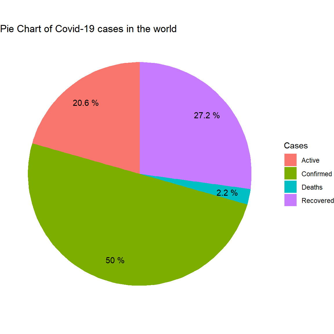
2.2 Top 10 nước có số cases lớn nhất
Tính tổng các cases của từng nước tính đến thời điểm hiện tại:
df_countries <- final_df %>% select(-Date) %>% group_by(Country.Region) %>% summarise_all(funs(sum))Top 10 nước có confirmed cases lớn nhất:
# Lọc top 10 nước theo Confirmed Cases
confirmed <- df_countries %>% arrange(desc(Confirmed)) %>% slice(1:10)
confirmed$Country.Region <- factor(confirmed$Country.Region, levels=unique(confirmed$Country.Region))
# Vẽ barplot
ggplot(confirmed, aes(x=Confirmed, y=Country.Region, fill= Country.Region))+
  geom_bar(stat='identity')+
  ggtitle("Top 10 Countries (Confirmed cases)") +
  theme_bw()+
  theme(legend.position="none")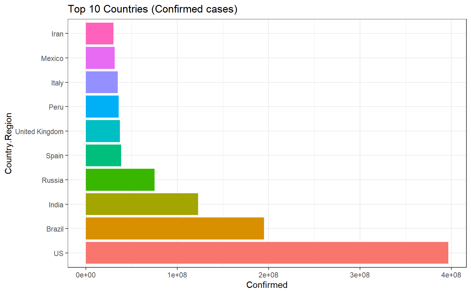
Top 10 nước có Death cases lớn nhất:
# Lọc top 10 nước theo Confirmed Cases
deaths<- df_countries %>% arrange(desc(Deaths)) %>% slice(1:10)

deaths$Country.Region <- factor(deaths$Country.Region, levels=unique(deaths$Country.Region))
ggplot(deaths, aes(x=Deaths, y=Country.Region, fill= Country.Region))+
  geom_bar(stat='identity')+
  ggtitle("Top 10 Countries (Deaths)") +
  theme_bw()+
theme(legend.position="none") 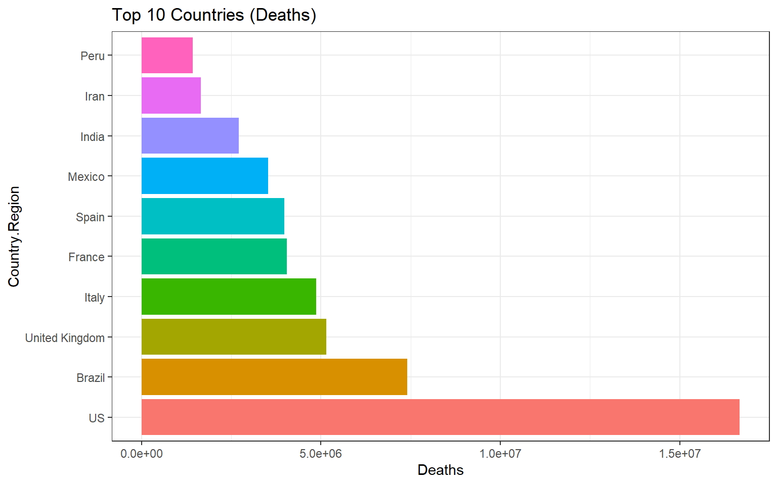
Top 10 nước có Recovered Cases lớn nhất:
# Lọc top 10 nước theo Confirmed Cases
recovered <- df_countries %>% arrange(desc(Recovered)) %>% slice(1:10)
recovered$Country.Region <- factor(recovered$Country.Region, levels=unique(recovered$Country.Region))
ggplot(recovered, aes(x=Recovered, y=Country.Region, fill= Country.Region))+
  geom_bar(stat='identity')+
  ggtitle("Top 10 Countries (Recovered Cases)") +
  theme_bw()+
  theme(legend.position="none")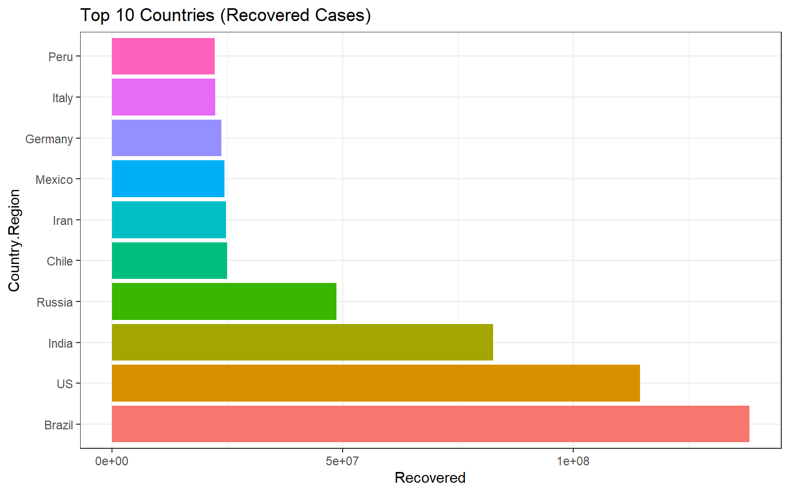
2.3 Mức độ phát triển của Covid-19 theo thời gian trên toàn thế giới
Tính tổng các cases trên toàn thế giới theo thời gian
world <- final_df %>% group_by(Date) %>% summarize(Confirmed=sum(Confirmed), Deaths=sum(Deaths), Recovered=sum(Recovered))Mức độ phát triển của Confirmed cases trên toàn thế giới theo thời gian:
ggplot(world, aes(x=Date, y=Confirmed)) + geom_bar(stat="identity", width=0.2, color = "blue") +
  theme_bw() +
labs(title = "Confirmed Cases In Each Days", x= "Date", y= "Confirmed cases") 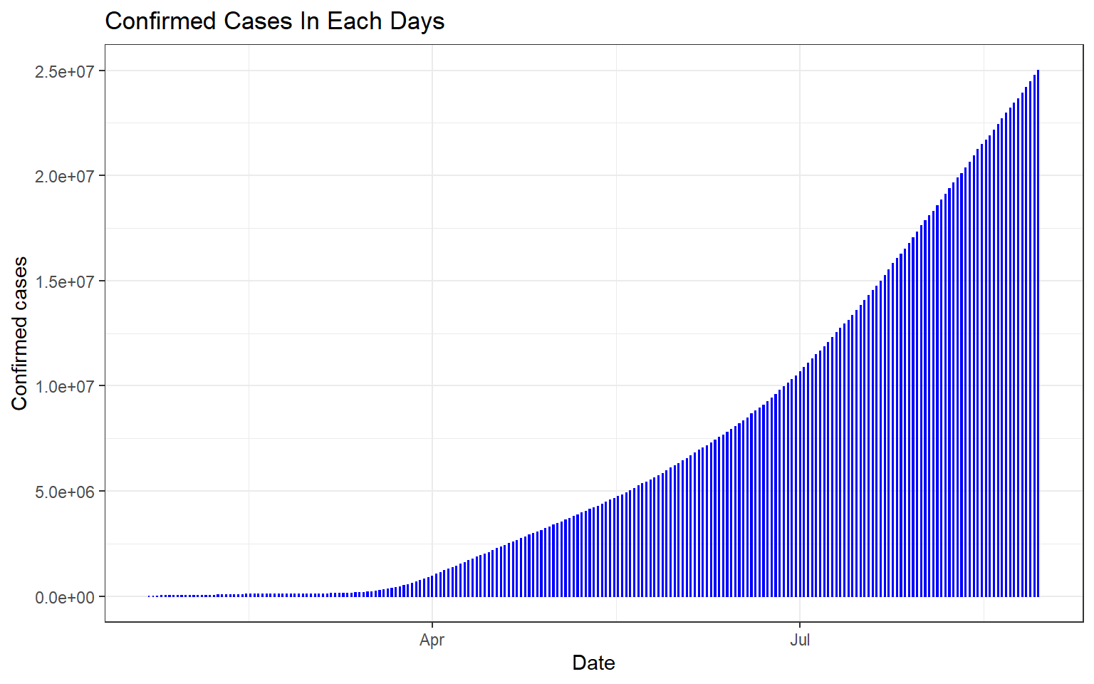
Mức độ phát triển của Deaths trên toàn thế giới theo thời gian:`
ggplot(world, aes(x=Date, y=Deaths)) + geom_bar(stat="identity", width=0.2, color = "green") +
  theme_bw() +
labs(title = "Deaths In Each Day", x= "Date", y= "Death cases") 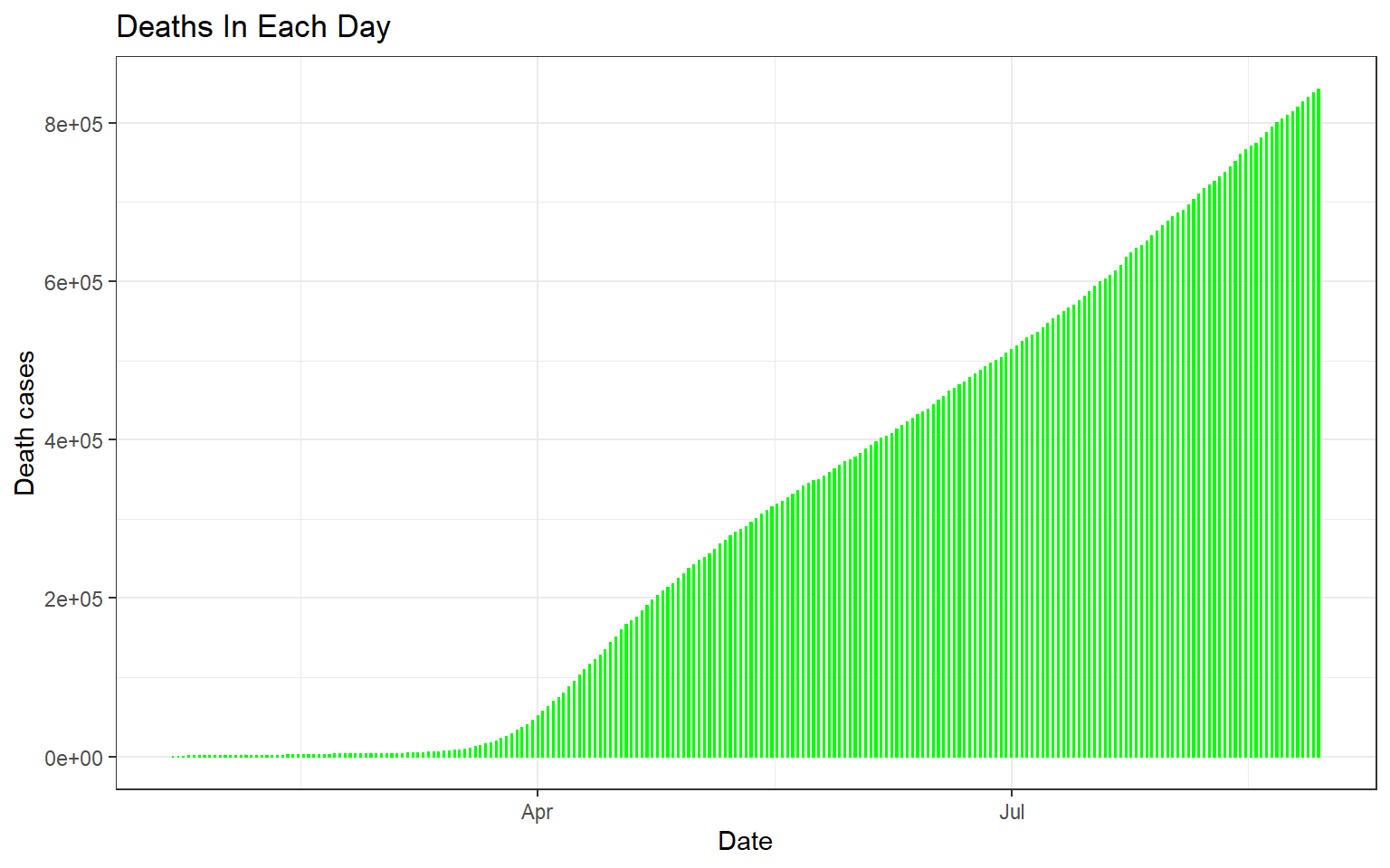
Mức độ phát triển của Recovered cases trên toàn thế giới theo thời gian:
ggplot(world, aes(x=Date, y=Recovered)) + geom_bar(stat="identity", width=0.2, color = "purple") +
  theme_bw() +
labs(title = "Recovered cases In Each Day", x= "Date", y= "Recovered cases") 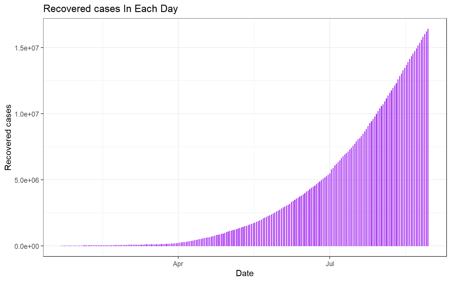
2.4 Hiển thị tất cả các cases trên thế giới theo thời gian
world %>% gather("Cases", "value", -Date) %>%
ggplot(aes(x=Date, y=value, colour=Cases)) + geom_bar(stat="identity", width=0.2, fill="white") +
  labs(title = "Covid-19 Global Cases", x= "Date", y= "Daily cases")+
  theme_bw()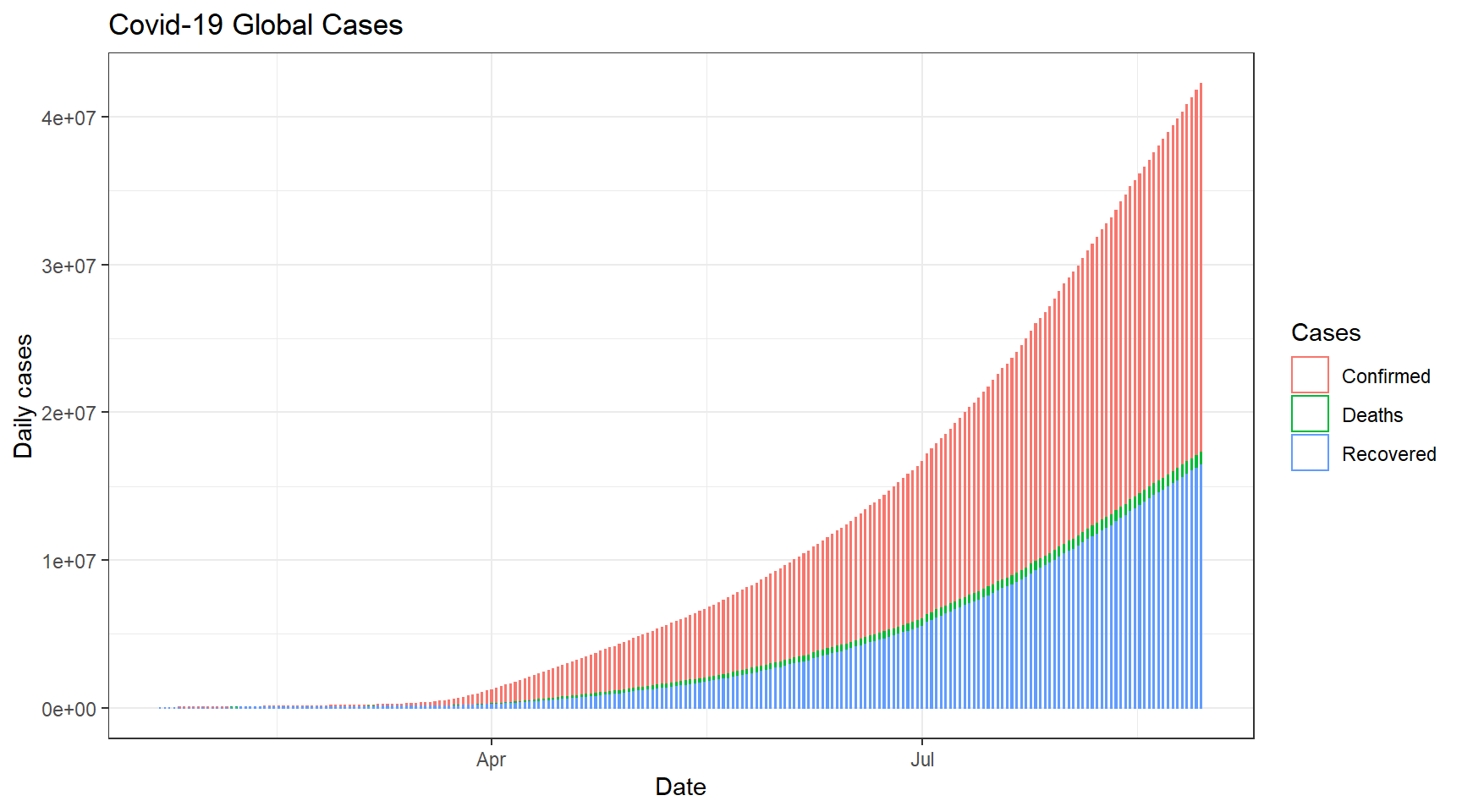
world %>% gather("Cases", "value", -Date) %>%
ggplot(aes(x=Date, y=value, colour=Cases)) + geom_line(, size = 1) +
  labs(title = "Covid-19 Global Cases", x= "Date", y= "Daily cases")+
  theme_bw()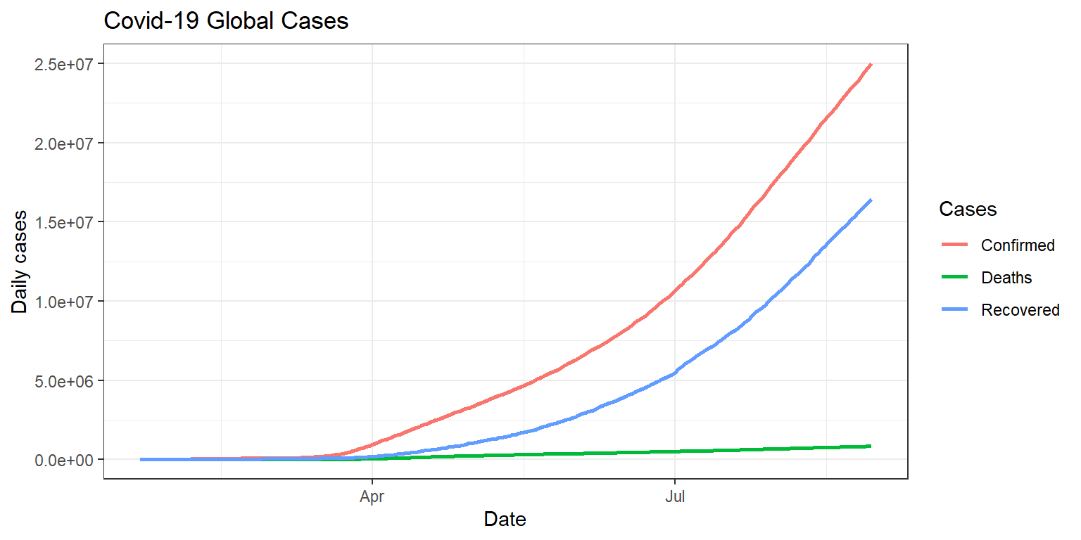
2.5 So sánh sự phát triển của COVID-19 theo thời gian giữa các nước
So sánh Việt Nam, Mỹ, Nga:
final_df %>% filter(Country.Region == "Vietnam") %>% gather("Cases", "value", -Country.Region, -Date) %>%
ggplot(aes(x=Date, y=value, colour=Cases)) + geom_line(, size = 1) +
  labs(title = "COVID-19 cases of Vietnam", x= "Date", y= "Daily cases")+
  theme_bw()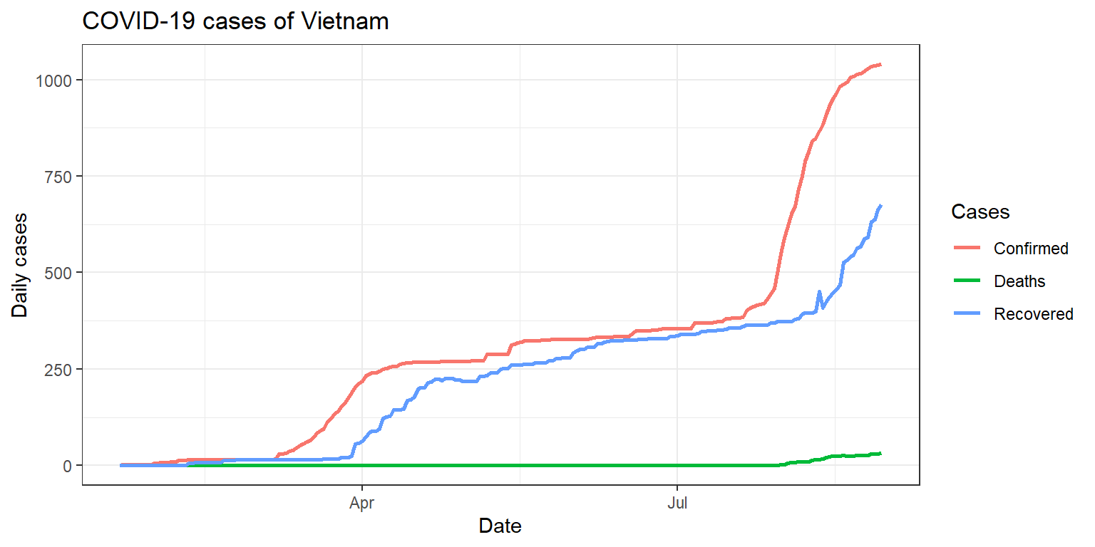
final_df %>% filter(Country.Region == "US") %>% gather("Cases", "value", -Country.Region, -Date) %>%
ggplot(aes(x=Date, y=value, colour=Cases)) + geom_line(, size = 1) +
  labs(title = "COVID-19 cases of US", x= "Date", y= "Daily cases")+
  theme_bw()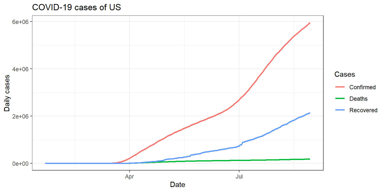
final_df %>% filter(Country.Region == "Russia") %>% gather("Cases", "value", -Country.Region, -Date) %>%
ggplot(aes(x=Date, y=value, colour=Cases)) + geom_line(, size = 1) +
  labs(title = "COVID-19 cases of Russia", x= "Date", y= "Daily cases")+
  theme_bw()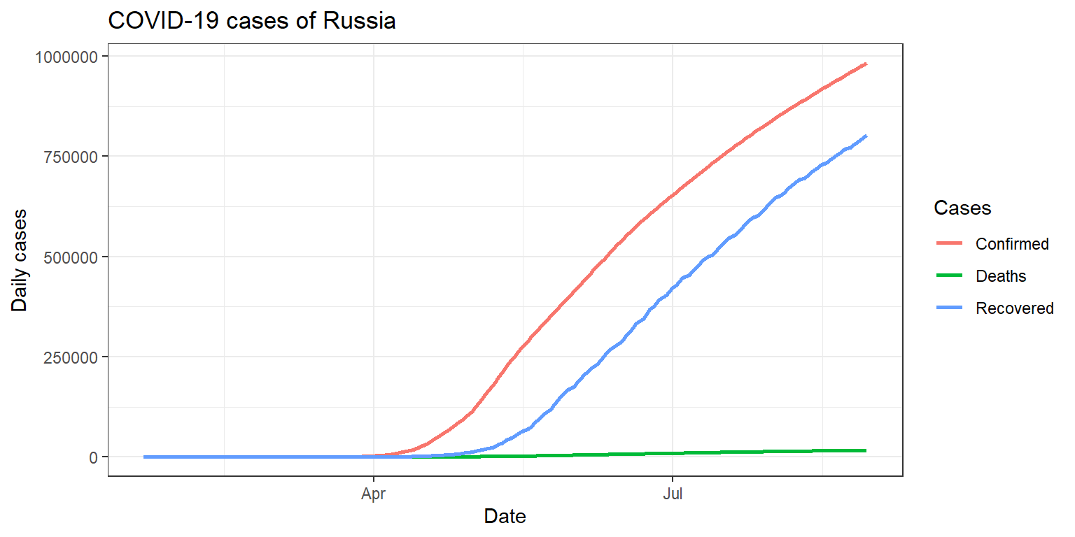
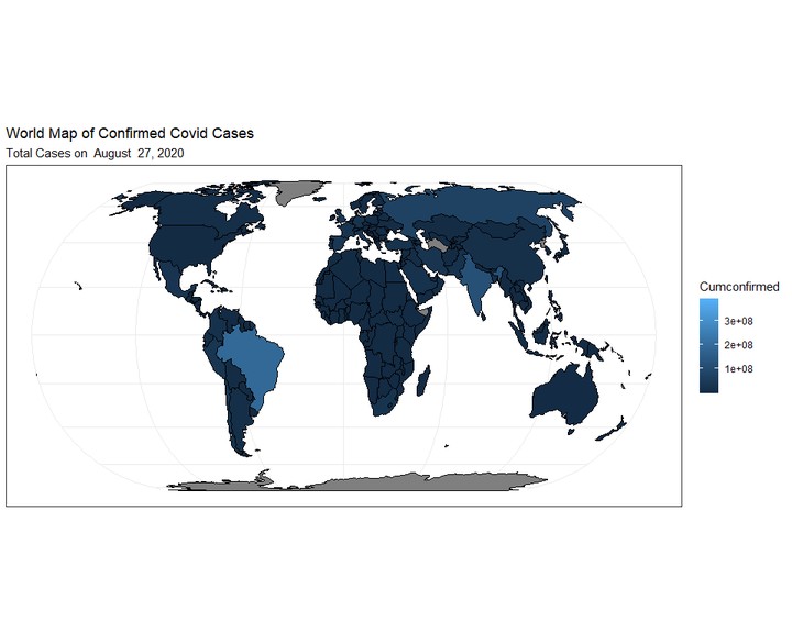
Do thực hiện công việc tương tự như Python nhưng mà nhanh quá, nên tôi thử tạo thêm bản đồ phân bố dịch này nữa:
# Chuẩn bị dữ liệu
country <- final_df %>% group_by(Country.Region) %>% mutate(Cumconfirmed=cumsum(Confirmed))

world <- country %>% group_by(Date) %>% summarize(Confirmed=sum(Confirmed), Cumconfirmed=sum(Cumconfirmed), Deaths=sum(Deaths), Recovered=sum(Recovered))
## Map
countrytotal <- country %>% group_by(Country.Region) %>% summarize(Cumconfirmed=sum(Confirmed), Cumdeaths=sum(Deaths), Cumrecovered=sum(Recovered))
# Basemap from package tmap
library(tmap)
data(World)
# Combine basemap data với covid data
list <- which(!countrytotal$Country.Region %in% World$name)
countrytotal$country <- as.character(countrytotal$Country.Region)
countrytotal$country[list] <-
c("Andorra", "Antigua and Barbuda", "Bahrain",
"Barbados", "Bosnia and Herz.", "Myanmar",
"Cape Verde", "Central African Rep.", "Congo",
"Dem. Rep. Congo", "Czech Rep.", "Diamond Princess",
"Dominica", "Dominican Rep.", "Eq. Guinea",
"Swaziland", "Grenada", "Holy See",
"Korea", "Lao PDR", "Liechtenstein",
"Maldives", "Malta", "Mauritius",
"Monaco", "MS Zaandam", "Macedonia",
"Saint Kitts and Nevis", "Saint Lucia", "Saint Vincent and the Grenadines",
"San Marino", "Sao Tome and Principe", "Seychelles",
"Singapore", "S. Sudan", "Taiwan",
"United States", "Palestine", "W. Sahara")
World$country <- World$name
worldmap <- left_join(World, countrytotal, by="country")
worldmap$cumconfirmed[is.na(worldmap$Cumconfirmed)] <- 0# Map
ggplot(data = worldmap) + geom_sf(aes(fill=Cumconfirmed), color="black") +
ggtitle("World Map of Confirmed Covid Cases",
subtitle="Total Cases on August 29, 2020") +
theme_bw()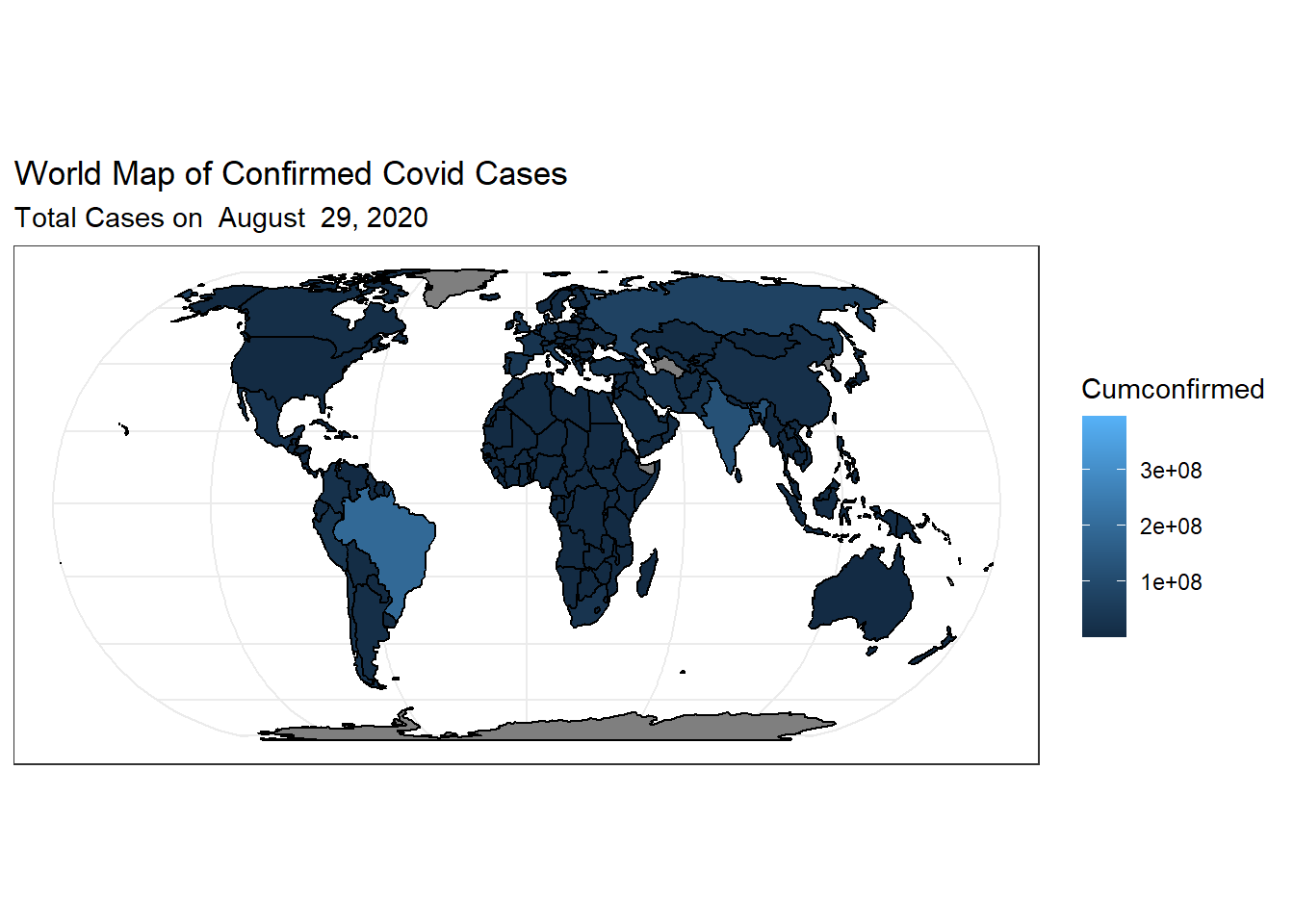
Cuong Sai
PhD student
My research interests include Industrial AI (Intelligent predictive maintenance), Machine and Deep learning, Time series forecasting, Intelligent machinery fault diagnosis, Prognostics and health management, Error metrics / forecast evaluation.